# create a variable called [url] which is the location of the file
url <- "https://www.dropbox.com/scl/fi/3z0phw1h42va1t79wm3e5/data_b1700_01.csv?rlkey=z612clpohrx3gwknavbo0cakb&dl=1"

# create a dataframe called [df] by calling the `read.csv` function
df <- read.csv(url)

# reduce the dataset to its first 250 rows
df <- df[1:250,]

# clear the variable [url] from the environment - it's good practice to remove variables you don't need again
rm(url)10 Data Visualisation
10.1 Learning Outcomes
By the end of this section, you should:
- be able to produce basic plots using the ggplot2 package
- understand the basic types of visualisations commonly used in data analysis
- understand the concept of layers within ggplot2
10.2 Introduction
Data visualisation is a critical element in sport data analytics, which is why we have an entire module devoted to the topic on the MSc. Visualisation offers the power to transform complex datasets into actionable insights. Using visualisation, we can more effectively communicate patterns, trends, and correlations in our data.
In this section, we are focusing on using data visualisation to explore our data. Specifically, we’ll learn how to implement some basic visualisations in R, and how these can be edited to make them easier to understand.
10.3 Dataset
I’ll use a dataset called [data_b1700_01.csv]. The raw data currently ‘sits’ in a remote dropbox folder.
The following code ‘pulls’ the data from the dropbox folder and allows me to work with the data directly:
10.4 Exploring Data using Base R
Base R (i.e., R as you initially download it) contains a number of functions that help us conduct an initial exploration of our data using visual techniques.
Viewing the data structure
Before creating visualisations, it’s essential to understand the structure of our data. Certain types of visualisation are more suited to some data types than others.
We can use the head and str commands to get an overview of the variables in our dataset, and their type:
# Display the first few rows of the dataset
head(df)
athlete_name age nationality sport height
1 Hastie Harrap 24 Democratic Republic of the Congo swimming 190.88
2 Colline Bellwood 20 Honduras basketball 169.67
3 Katya Rotchell 25 United States football 162.38
4 Karney Martensen 30 Ireland football 161.02
5 Thorndike Pieroni 35 Indonesia basketball 175.63
6 Leodora Bramall 32 Canada swimming 186.93
weight personal_best
1 78.21 20.38
2 91.36 6.10
3 59.39 8.49
4 74.98 90.86
5 86.03 91.16
6 73.78 96.60# Display the structure of the dataset
str(df)'data.frame': 250 obs. of 7 variables:
$ athlete_name : chr "Hastie Harrap" "Colline Bellwood" "Katya Rotchell" "Karney Martensen" ...
$ age : int 24 20 25 30 35 32 32 35 22 32 ...
$ nationality : chr "Democratic Republic of the Congo" "Honduras" "United States" "Ireland" ...
$ sport : chr "swimming" "basketball" "football" "football" ...
$ height : num 191 170 162 161 176 ...
$ weight : num 78.2 91.4 59.4 75 86 ...
$ personal_best: num 20.38 6.1 8.49 90.86 91.16 ...
Important
To reference a variable in R, we use the format dataframe$variablename. In other words, to do something to the variable [height] in the dataframe [df], we would use df$height.
As you read through the examples below, notice how this format is used consistently when visualising the variables that are contained in the dataset [df].
This may be different to how you have referenced variables in other statistical packages such as SPSS. It’s useful because we can have multiple dataframes in our environment containing the same variable names, but R will always know which dataframe we are referring to!
Creating basic visualisations
Remember that different types of variable will suit different methods of visualisation.
Histogram of Age
A histogram is useful to visualise the distribution of a single numeric variable, such as [age].
# Creating a histogram for Age
hist(df$age,
     main = "Distribution of Age",
     xlab = "Age (years)",
     col = "lightblue",
     border = "black")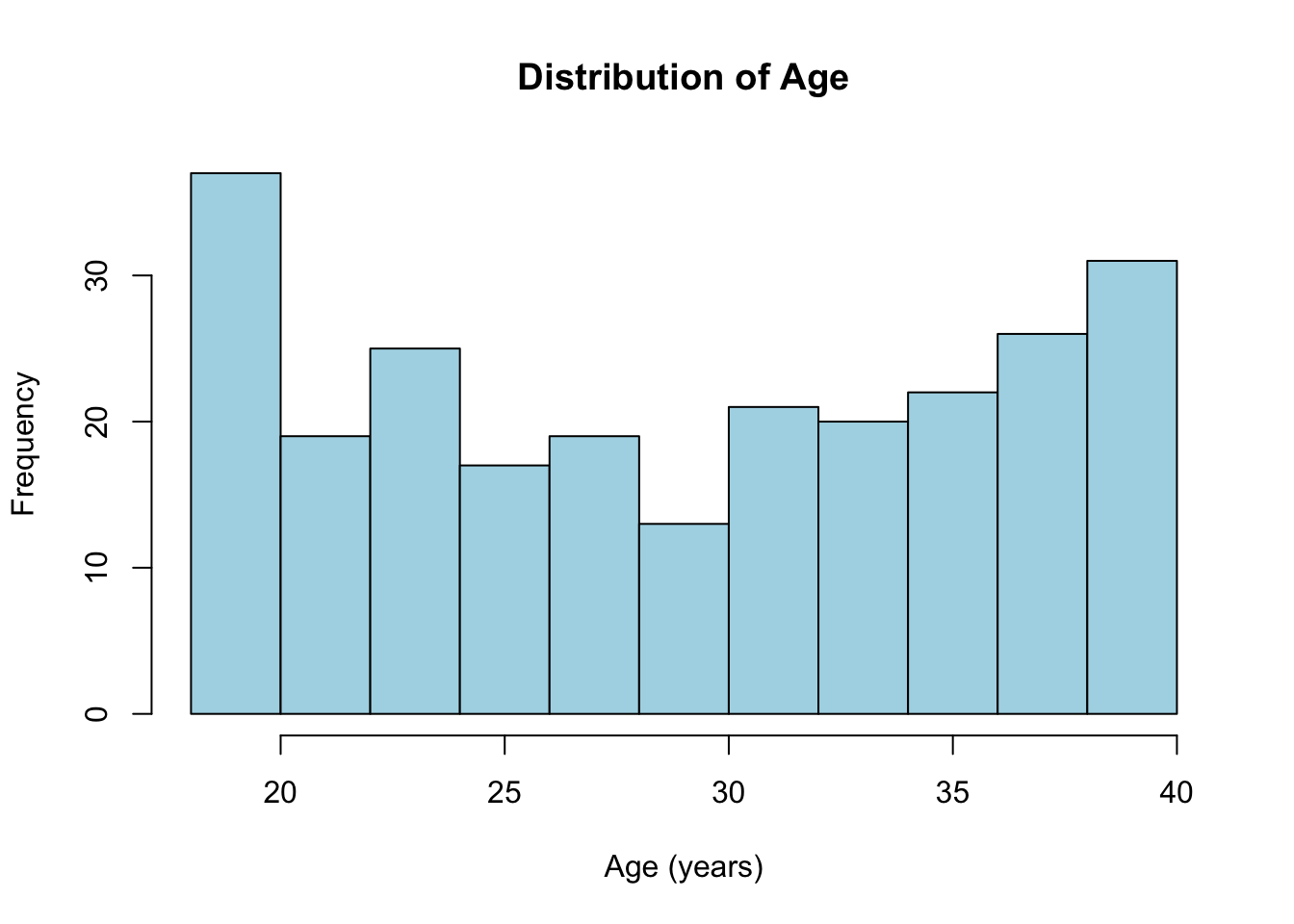
# In the code above, notice that I've specified df$age (i.e., create a histogram of the variable [age] which is contained within the dataframe [df])Bar plot of nationality
A bar plot is ideal for visualising the frequency of categorical variables like [nationality].
# Creating a bar plot for Nationality
barplot(table(df$nationality),
        main = "Frequency of Nationalities",
        xlab = "Nationality",
        ylab = "Count",
        col = "lightgreen",
        las = 2) # las=2 makes the labels perpendicular to the axis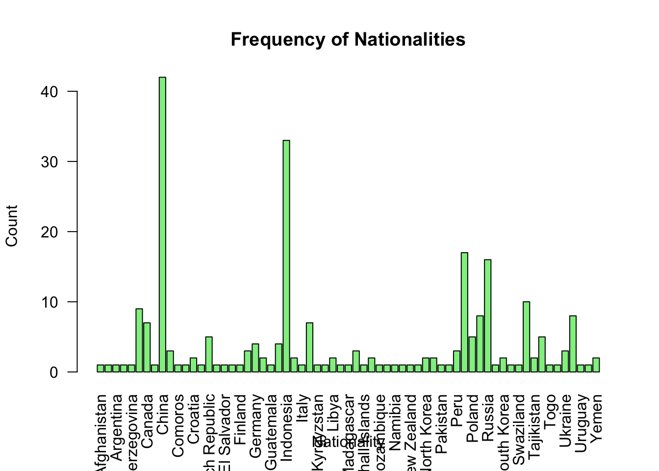
Pie chart of sports distribution
A pie chart provides a simple way to visualise the proportion of categories within a variable like [sport].
# Creating a pie chart for Sport
sport_counts <- table(df$sport)
pie(sport_counts,
    main = "Distribution of Sports",
    col = rainbow(length(sport_counts)))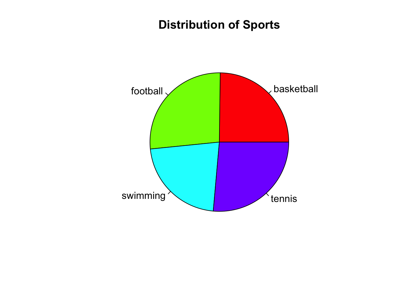
Scatter plot of [height] vs. [weight]
A scatter plot is useful for visualising the relationship between two numeric variables, such as [height] and [weight].
# Creating a scatter plot for height vs. weight
plot(df$height, df$weight,
     main = "Height vs. Weight",
     xlab = "Height (cm)",
     ylab = "Weight (kg)",
     col = "blue",
     pch = 19) # pch=19 gives filled circles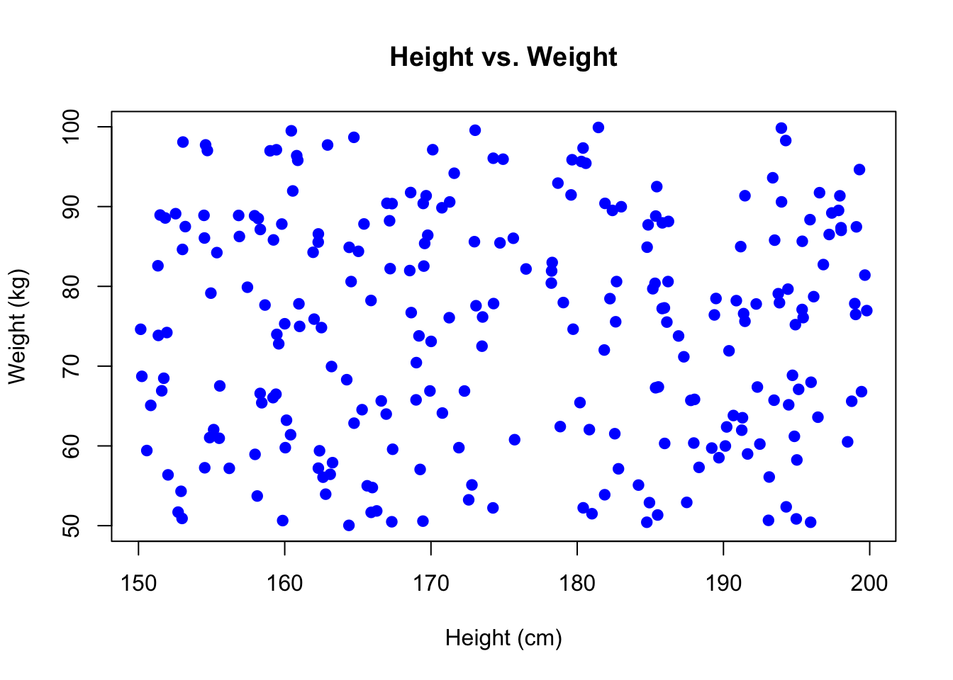
Important
Notice that, in the examples above, I’ve always included the unit of measurement in the axis labels. This is critical and you’ll be expected to adhere to this across the MSc.
Boxplot of [height] by [sport]
Boxplots are useful for comparing distributions of numeric data across different categories.
# Creating a boxplot for height by sport

boxplot(df$height ~ df$sport,
        main = "Height by Sport",
        xlab = "Sport",
        ylab = "Height (cm)",
        col = "orange",
        las = 2)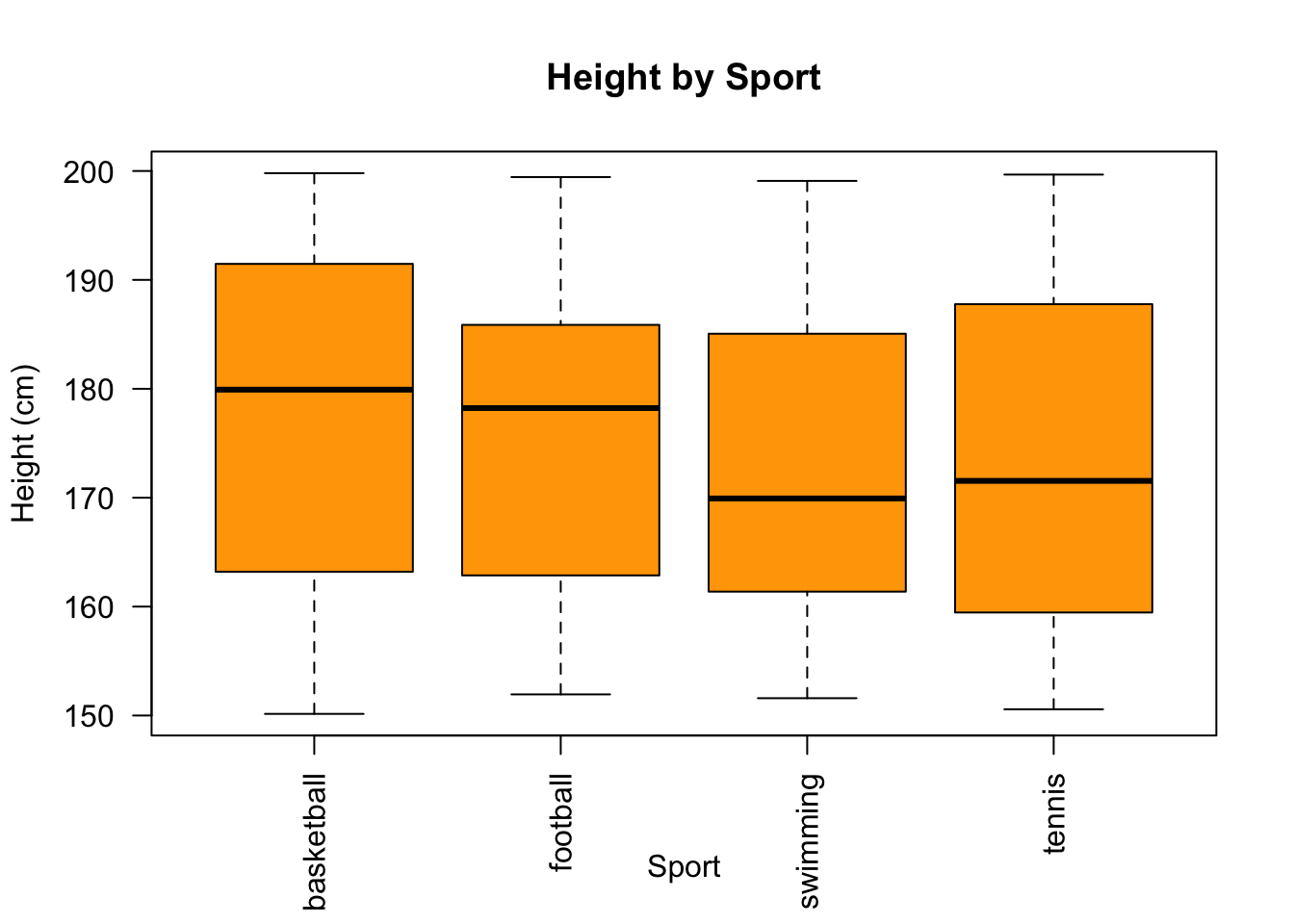
# note: las=2 makes the labels perpendicular to the axis
Note
Remember the importance of defining grouping variables as factors. In this case, [sport] is being used as a grouping variable.
In the code examples above, I’ve used indentation to make the code more ‘readable’ (remember what we discussed earlier in the module about coding principles). However, the following would work equally well:
# Creating a boxplot for height by sport
boxplot(df$height ~ df$sport, main = "Height by Sport", xlab = "Sport", ylab = "Height (cm)", col = "orange", las = 2)
Customising plots
R’s base plotting system allows for extensive customisation. Here are some basic ways to enhance your plots:
- Change colours: We can use the
colargument to specify colours. - Adjust labels: Modify
xlab,ylab, andmainfor axis labels and titles. - Rotate text: Use the
lasargument to rotate axis labels. - Add grid lines: Use the
grid()function after your plot to add grid lines.
For example, adding grid lines to the scatter plot, and making the points red:
plot(df$height, df$weight,
     main = "Height vs. Weight",
     xlab = "Height (cm)",
     ylab = "Weight (kg)",
     col = "red",
     pch = 19)
grid()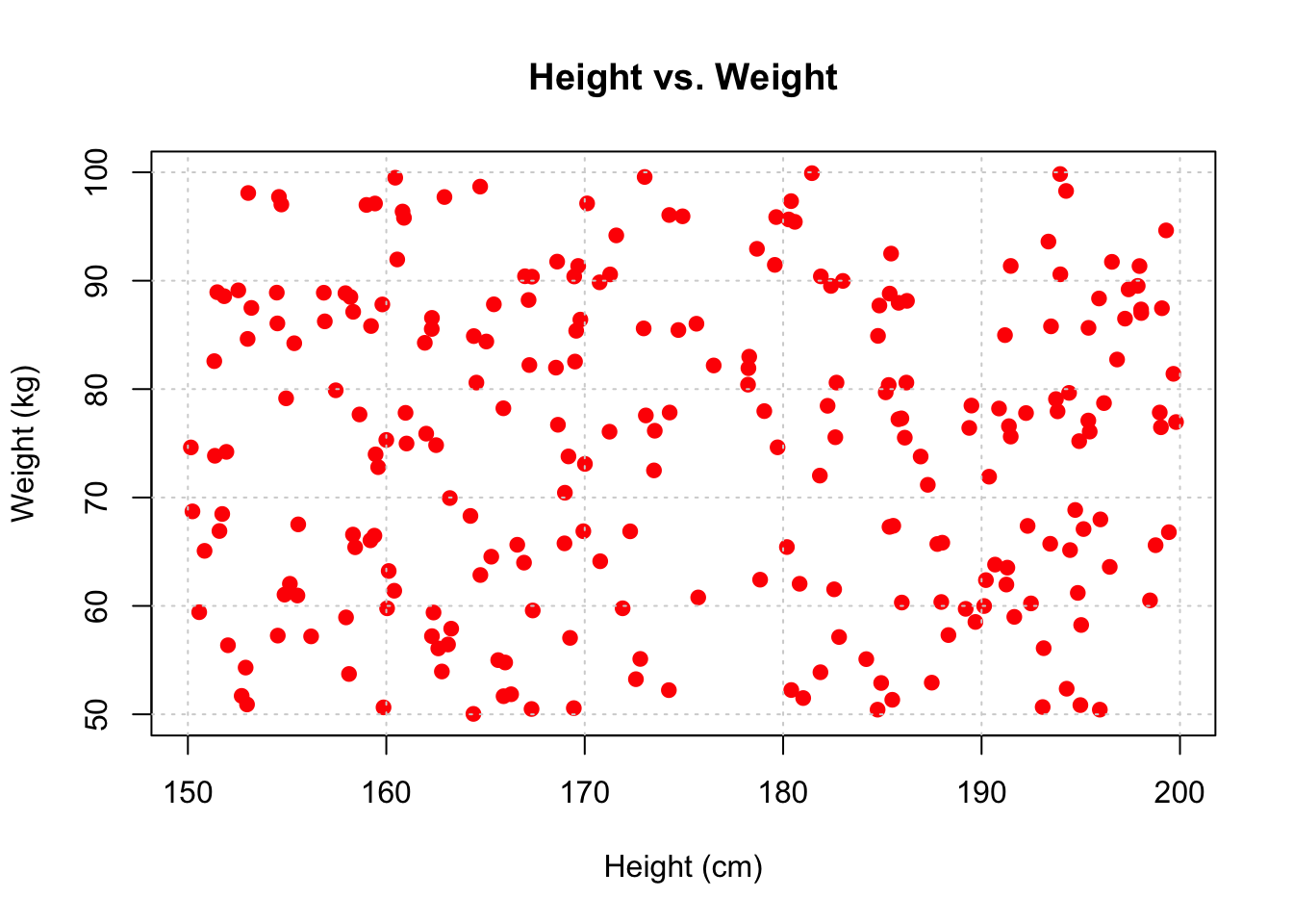
Saving plots
When we’re happy with our plots (or ‘figures’ as we would call them within a paper, thesis etc.), we probably want to save them directly to our drive or storage device.
Remember: by default, these plots will be stored in your project directory, unless you specify otherwise.
We can save our plots to a file in a number of ways using base R, for example:
# Save as PNG

png("scatterplot_height_weight.png")

# Create the scatter plot
plot(df$height, df$weight, main = "Height vs. Weight", xlab = "Height (cm)", ylab = "Weight (kg)", col = "blue", pch = 19)

# Close the PNG device
dev.off()
quartz_off_screen
2 10.5 Introduction to ggplot2
The previous section explored visualisation in base R. However, as you’re probably realising, there are lots of different ways to do things in R, and for data visualiation the ggplot2 package is incredibly powerful.
It’s built on the principles of the “Grammar for Graphics”, which is a systematic approach to create complex and customisable graphics from simple components.
A ggplot2 graphic is created by adding layers to a base plot. The base plot is created using the ggplot() function, and additional layers, such as geometries, scales, and themes, are added using the + operator.
Here is the basic structure of a ggplot2 plot:
library(ggplot2) # make sure ggplot is loaded


# we start by creating the plot in the first line
# then we add more layers to create the final visualisation

    ggplot(data = data, mapping = aes(x = x_variable, y = y_variable)) +
     geom_<type>(...) +
     scale_<type>(...) +
     theme_<type>(...)
10.6 Creating basic plots in ggplot2
A simple scatter plot
To create a scatter plot, we can use the geom_point() geometry.
Notice in this example that we create an object called [scatter_plot], and then specify what is in that object.
# Load required packages

library(ggplot2)

# Define scatter_plot
scatter_plot <- ggplot(df, aes(x = height, y = personal_best)) +
  geom_point() +
  labs(x = "Height (cm)", y = "Personal Best (secs)", title = "Height vs. Personal Best")

# now, we can 'call' the object scatter_plot
scatter_plot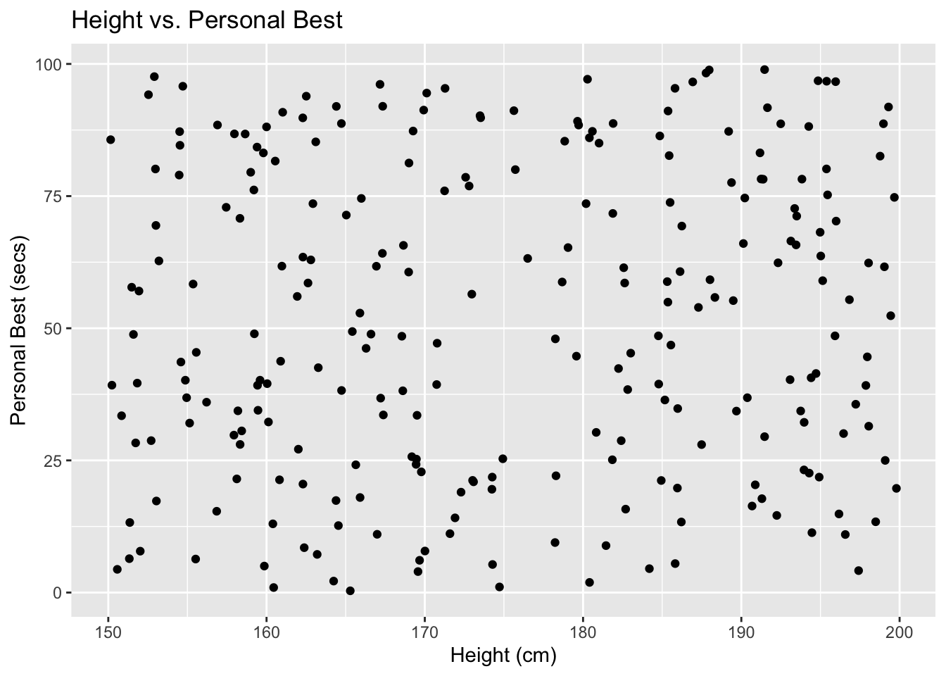
Creating a line graph
To create a line graph, we simply replace the command ‘geom_point’ with ‘geom_line()’.
# Line plot
line_plot <- ggplot(df, aes(x = height, y = personal_best)) +
  geom_line() +
  ylab("Personal Best (secs)") +
  xlab("Height (cm)")


line_plot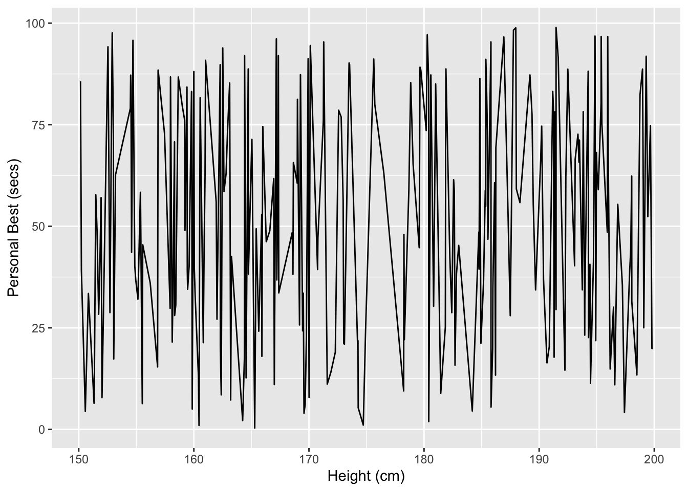
Creating bar plots and histograms
We may wish to plot frequencies for a single variable, or bar plots by grouping variable.
For a bar plot, we can use
geom_bar()For a histogram we can use
geom_histogram():
histo_plot <- ggplot(df, aes(x = height)) +
  geom_histogram() +
  xlab("Height (cm)")


histo_plot
`stat_bin()` using `bins = 30`. Pick better value with `binwidth`.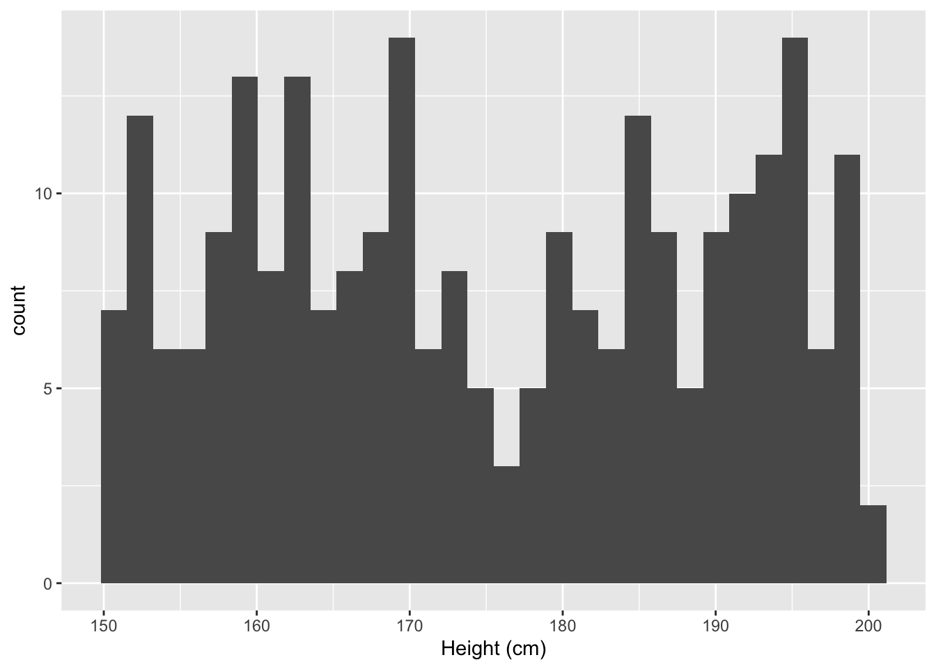
For a box plot geom_boxplot() can be used. In this example, I’ve introduced another function called theme, which helps determine the look of the plot:
plot <- ggplot(df, aes(x=factor(sport), y=personal_best))+
  geom_boxplot()+
  theme( legend.position = "none" )

plot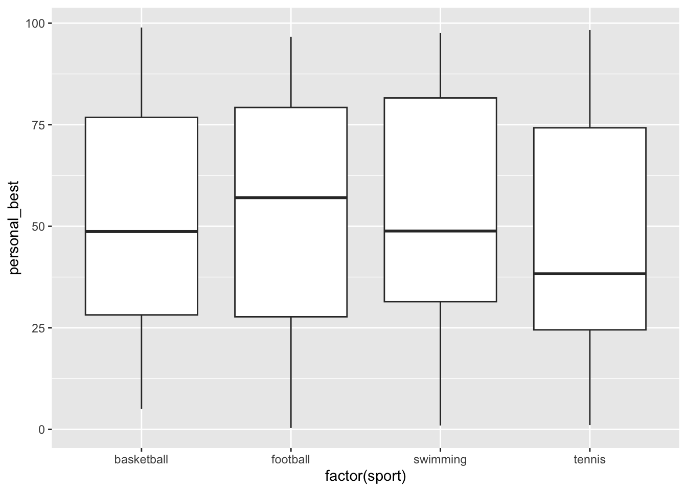
And for a violin plot use geom_violin():
Note: You may not have encountered violin plots before. A violin plot visualises the distribution, density and spread of data.
# Basic violin plot

df$sport <-as.factor(df$sport)
p <- ggplot(df, aes(x=sport, y=height)) +
  geom_violin() +
  ylab("Height (cm)")

p + stat_summary(fun.y=mean, geom="point", size=2, color="red") # this adds the mean
Warning: The `fun.y` argument of `stat_summary()` is deprecated as of ggplot2 3.3.0.
ℹ Please use the `fun` argument instead.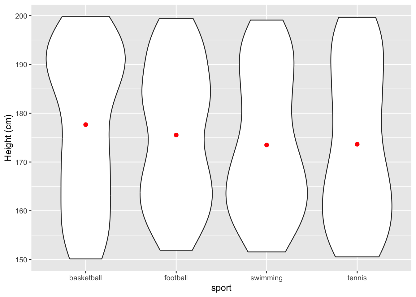
10.7 Customising plot aesthetics (colour, size, shape, etc.)
ggplot2 is enormously powerful. You can customise the appearance of a plot plot by adding additional layers or modifying the aesthetics. For example:
# Customised scatter plot with colour and size

df_cut <-df[5:30,] # I'm creating a subset of the data for ease of visualisation

scatter_plot <- ggplot(df_cut, aes(x = personal_best, y = height, color=age, size=weight)) +
  geom_point(alpha = 0.7) +
  xlab("Age (yrs)") +
  ylab("Height (cm)") +
  scale_color_gradient(low = "blue", high = "red") +
  theme_minimal()

scatter_plot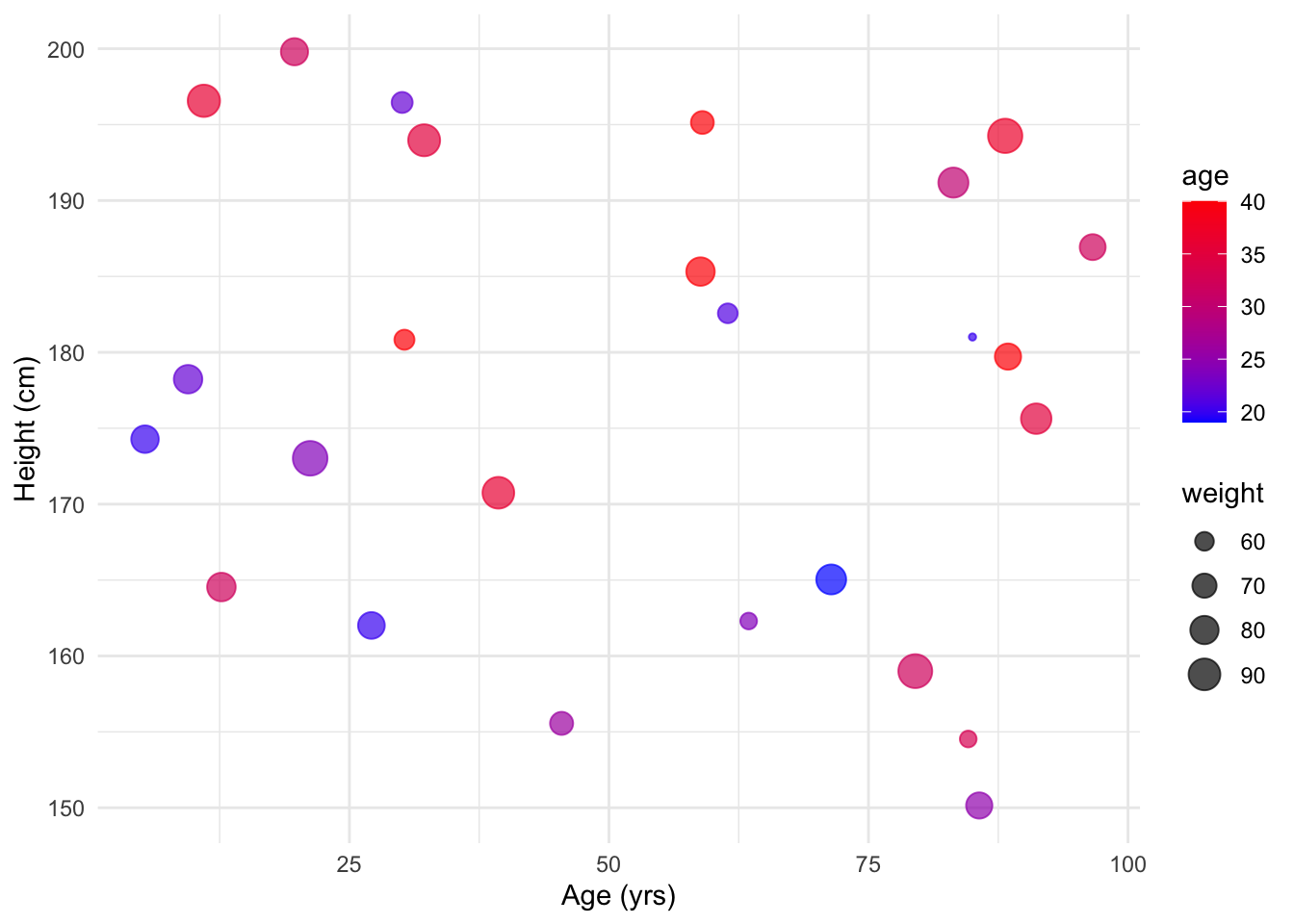
10.8 Adding layers
You can add multiple geometries to a single ggplot2 plot, making the production of complex figures fairly straightforward.
# Scatter plot with regression line
scatter_plot_with_line <- ggplot(df, aes(x = height, y = personal_best)) +
  geom_point() +
  geom_smooth(method = "lm", se = FALSE, color = "red") +
  theme_bw()

scatter_plot_with_line
`geom_smooth()` using formula = 'y ~ x'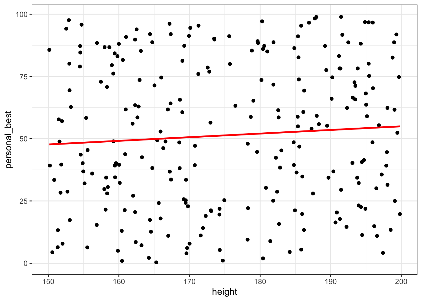
10.9 Faceting plots for multiple categories
Faceting is a powerful feature in ggplot2 that allows you to create multiple small plots based on a categorical variable within a single visualisation.
This technique is useful for exploring patterns and relationships in your data across different categories or groups.
Facet Wrap
facet_wrap() creates a set of small plots arranged in a grid, where each plot represents a subset of the data based on the values of one or more categorical variables. The plots are arranged in a single row or column and then wrapped, similar to how text wraps in a paragraph.
Example: Scatter plot faceted by a single categorical variable.
# Scatter plot faceted by 'category'

scatter_plot_facet_wrap <- ggplot(df, aes(x = height, y = weight)) +
  geom_point() +
  facet_wrap(~sport) +
  labs(x = "Height (cm)", y = "Weight (kg)", title = "Height vs. Weight")


scatter_plot_facet_wrap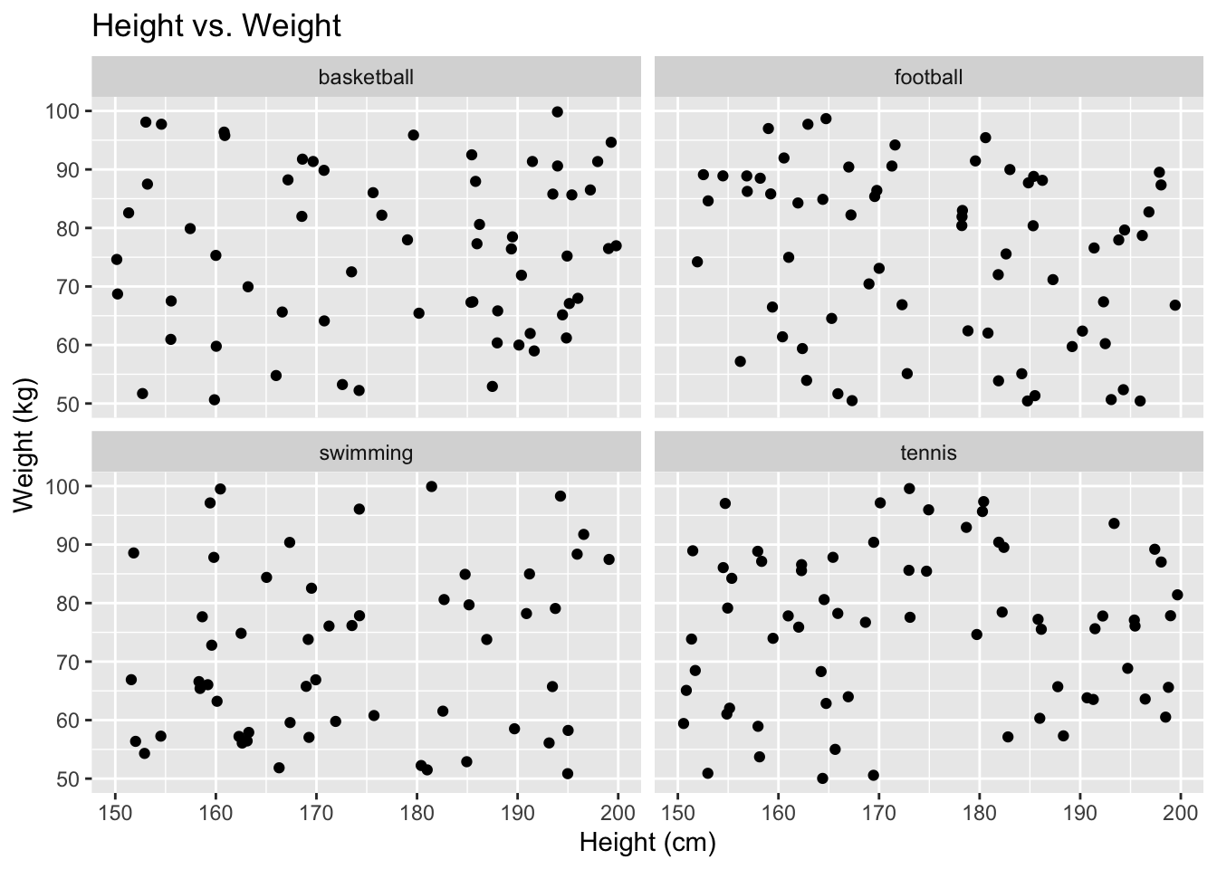
There is a really useful guide to creating graphs in R here and an excellent overview of ggplot2, with lots of examples here.